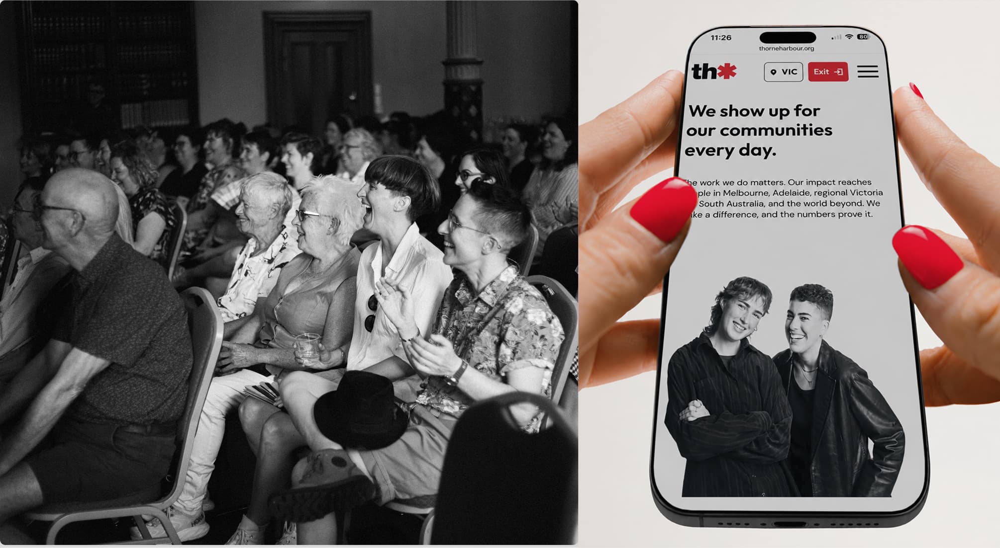
A website rebuild for an LGBTIQA+ health service 40 years in the making.
Services —
Branding
UX/UI Design
Web Design & Development
Industries —
Government & Community
Thorne Harbour Health has served LGBTIQ+ communities across Victoria and South Australia since 1983, starting as the Victorian AIDS Council. Four decades of growth had left them with clinics, counselling, family violence services, peer groups, campaigns and a radio show, all sitting on a website that had grown alongside them without anyone stopping to reorganise it. They came to us for a full information architecture rebuild ahead of a new website design.
Challenge
The site was an org chart. Services were grouped by which internal team ran them, not by what someone arriving in crisis was trying to do. South Australia had its own section that duplicated services already listed elsewhere. HIV and sexual health were split across two areas despite being the same conversation. Women’s Health, Multicultural Health and Aboriginal and Torres Strait Islander Health each had their own branch, all pointing back to the same underlying services.
Process
We ran a discovery workshop with THH’s marketing and services teams, then worked through the site page by page with them, sorting every item into service, program or campaign. That audit did more work than anything else. It surfaced pages built as SMS landing destinations, a conference resource that never left the nav, and a profiles project that had finished two years earlier.
Alongside it, we ran a community survey and built journey maps for target users.
Information architecture organised around intent, not departments
Services, Health Info, Get Involved, About, Contact. Every label describes something a person wants to do rather than a team that exists. Services opens on a landing page with a filter, so someone who knows they need testing gets there in one click and someone who doesn’t know what they need can browse by need or location instead.
Colour doing the wayfinding
The brand work and the architecture were built to the same plan. Each section of the site carries its own palette, muted for surfaces and a brighter version for buttons and links, sitting alongside the red, black and white the organisation already owned. Someone moving between Services and Health Info can feel the shift before they read the heading, and the softer tones answer the survey feedback that the old site felt clinical and heavy.
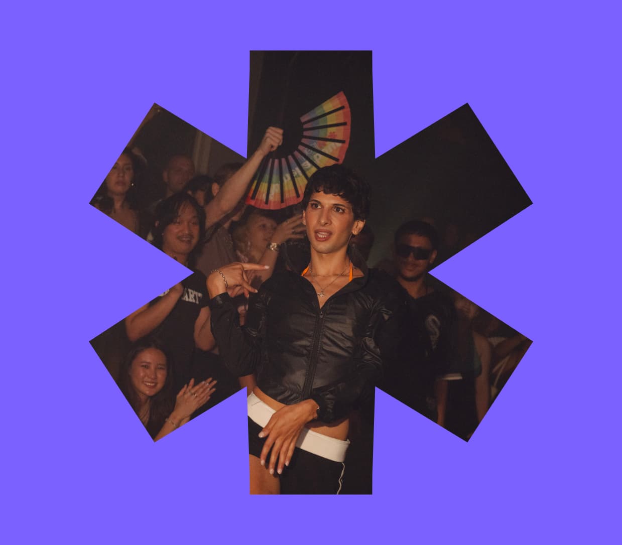
The asterisk becomes the container
The logo’s asterisk already carried 40 years of recognition, so we made it structural rather than decorative. The thumbnail system runs on typography, solid iconography, asterisk masks and a category tag, so a mental health update and an expression of interest both look like THH without a photo shoot. Where photography does exist, the asterisk mask and a red overlay pull it into the palette giving THH a way to publish visually when there’s no photograph available.