A national resource hub helping healthcare professionals deliver inclusive, affirming care to LGBTIQ+ communities.
Services —
Branding
UX/UI Design
Web Design & Development
Industries —
Government & Community
All Are Welcome is a national platform developed by Thorne Harbour Health to support GPs and healthcare professionals with practical guidance on LGBTIQ+ inclusive practice. The existing site was inaccessible and no longer met the needs of its users.
Your Creative was brought in to lead a full website redesign: delivering new UX, a searchable resource hub, custom brand identity, responsive development, content migration, and CMS handover within a six-week timeline.
Challenge
The site needed to function as a long-term, low-maintenance national resource that could be independently managed by a small team while serving a broad professional audience. The existing brand leaned heavily on illustrations, which would require ongoing effort to refresh. The resource library had grown complex, with multiple content types, organisations, categories, and tags that needed to surface clearly without overwhelming the user.
Process
Using a human-centred design approach, the team began with competitive analysis across health hubs and LGBTIQ+ platforms, with a specific focus on search and filter functionality, identified early as the crux of the experience.
The project ran across six weeks: kick-off and co-design workshop in week one, wireframes and sitemap in week two, visual design and accessibility system in week three, development and content load across weeks four and five, and CMS handover and launch in week six.
UX design and information architecture
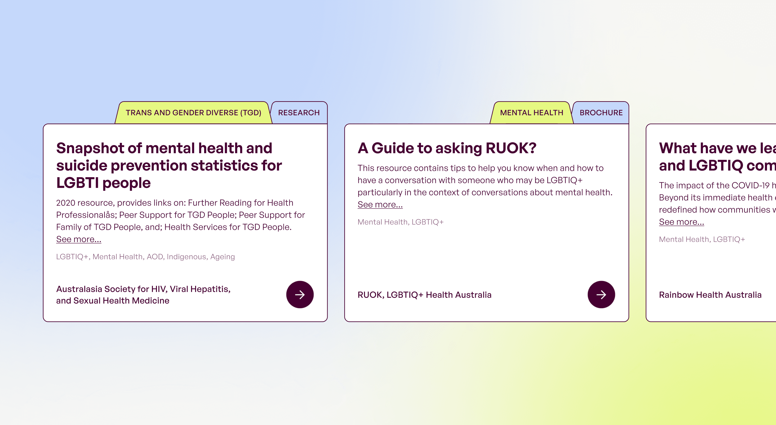
The resource hub presented a genuine information architecture challenge with its multiple content types, organisations, categories, and tags that needed to surface intuitively for time-poor healthcare professionals. The team developed a tab-based filing system as the primary navigation metaphor, referencing the logic of academic and medical archives. This gave the interface a structured, familiar feel suited to its GP audience while keeping the underlying complexity invisible.
Brand identity design
With no existing brand to build from, the visual identity was developed from scratch to meet a specific brief: future-proof, professional yet neutral enough for a clinical context without alienating LGBTIQ+ users.
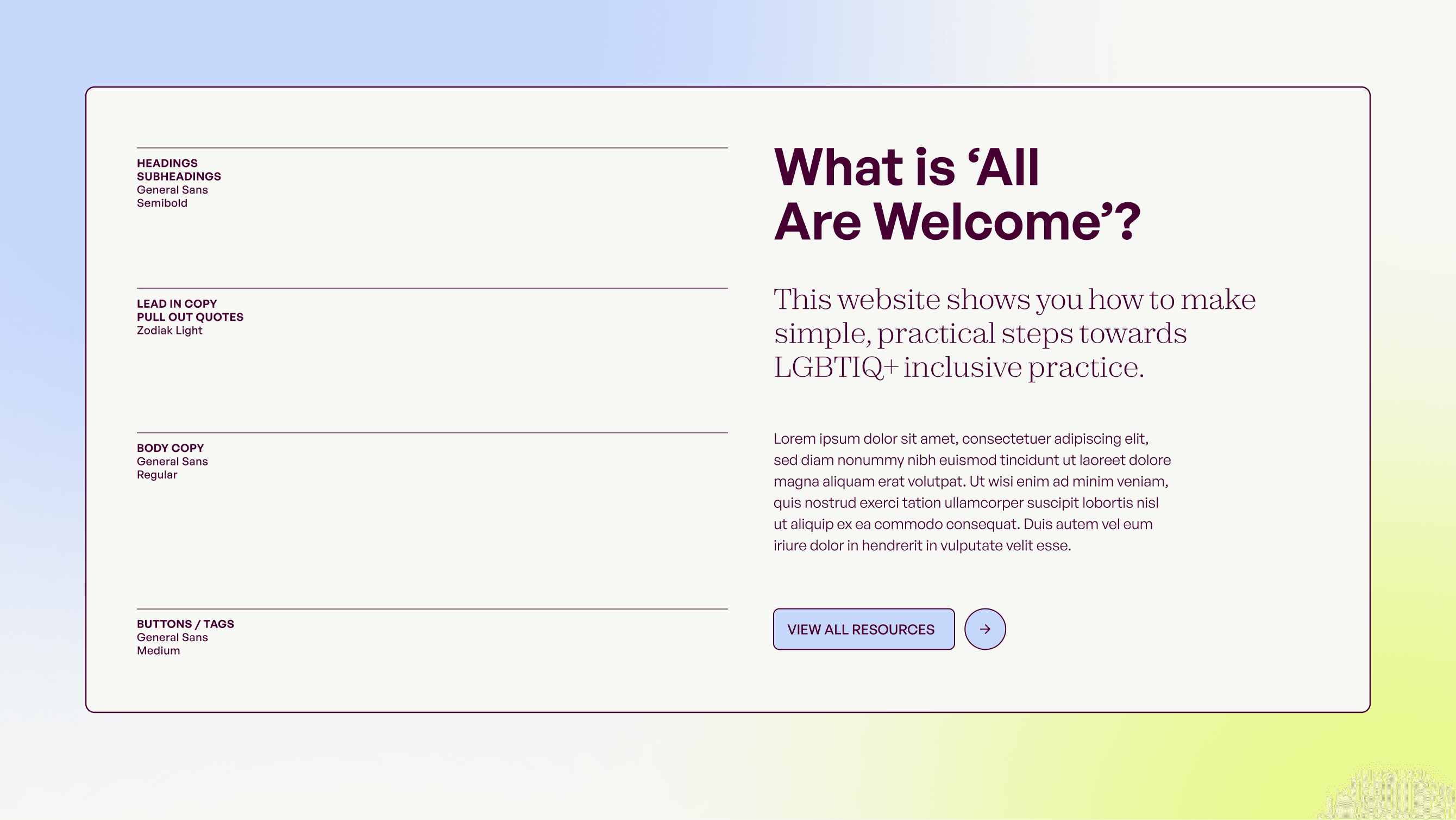
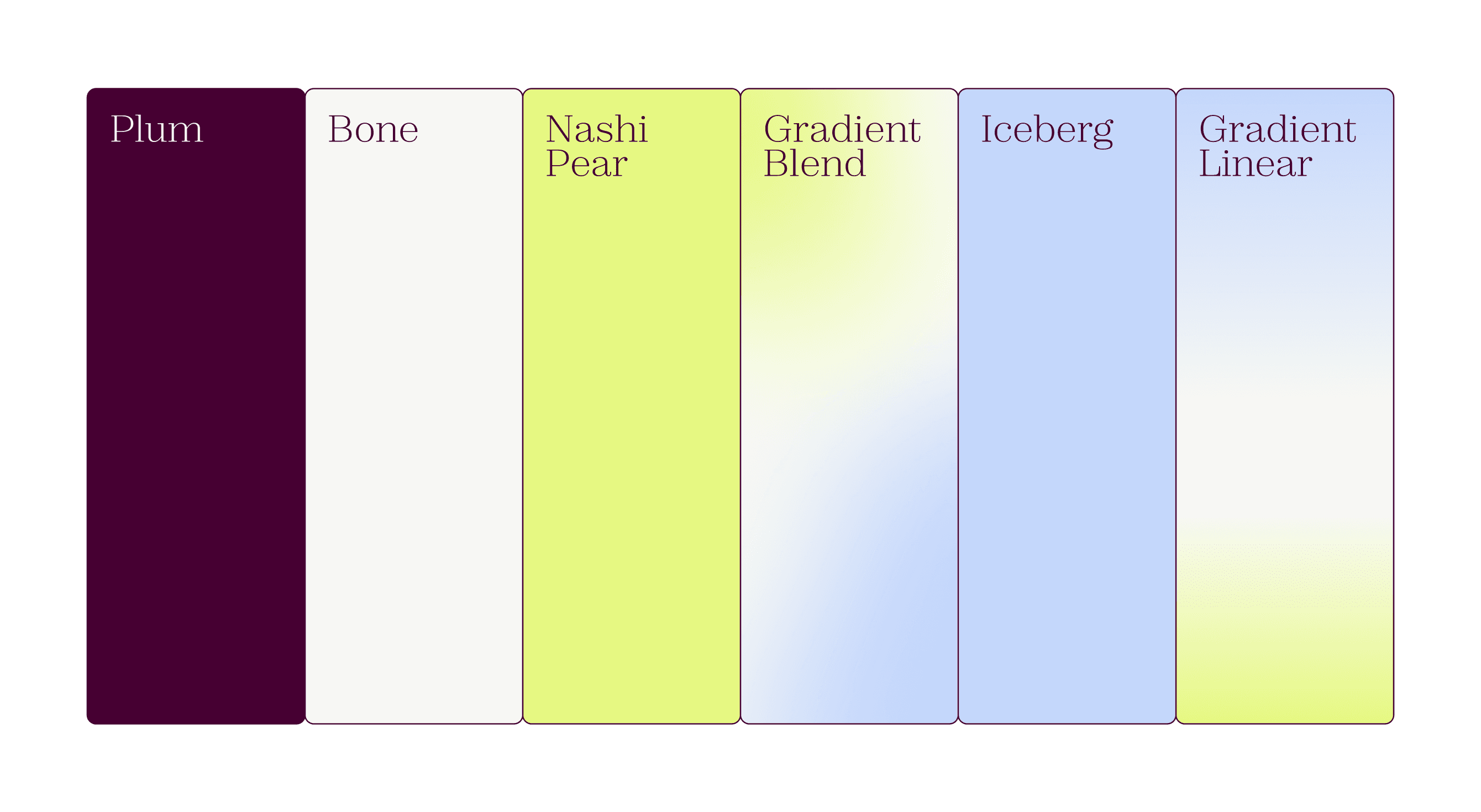
The decision to move away from illustration was deliberate; they were harder to scale and could date quickly with the organisation’s expansion. Instead, the palette carries the work. A deep maroon grounds the brand with warmth and authority, paired with a neon green and blue that bring a digital, medical edge. Open-source fonts with multiple weights were chosen to support complex, article-heavy content without ongoing licensing costs.
The brandmark is a stylised AAW; it also reads as two overlapping forms to represent the intersection of the GP community and the LGBTIQ+ people they care for.
Responsive development
The build was optimised for mobile and low-bandwidth access with regional healthcare settings in mind, a practical requirement for a national platform serving professionals across metro and rural Australia.
A flexible CMS with full training and documentation ensures the Thorne Harbour team can manage and grow the platform independently.