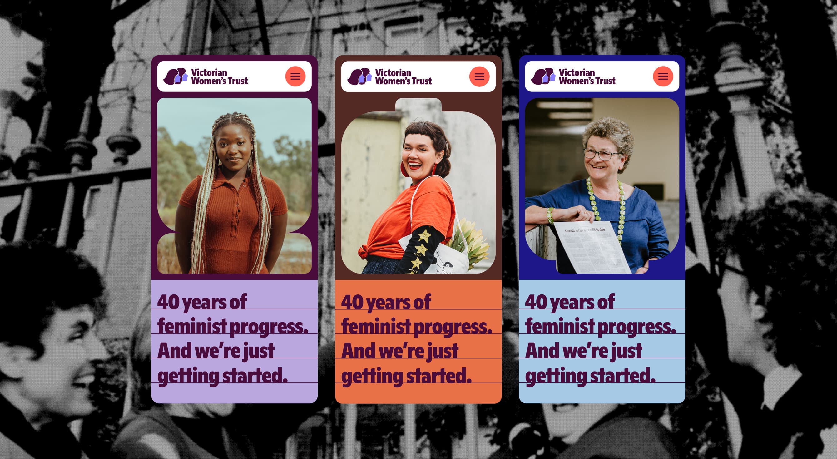
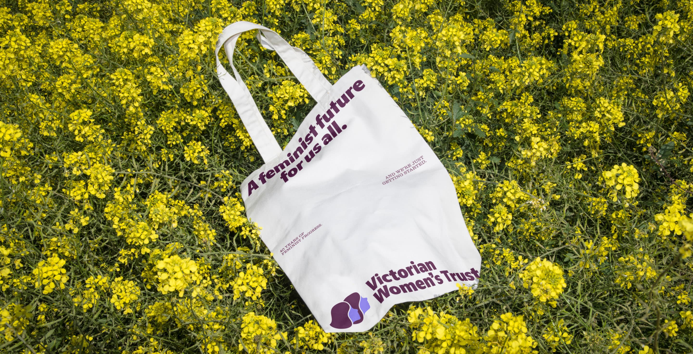
Forty years of feminist funding, rebuilt for the next forty.
Services —
Branding
Photography & Video
Strategy
UX/UI Design
Web Design & Development
Industries —
Government & Community
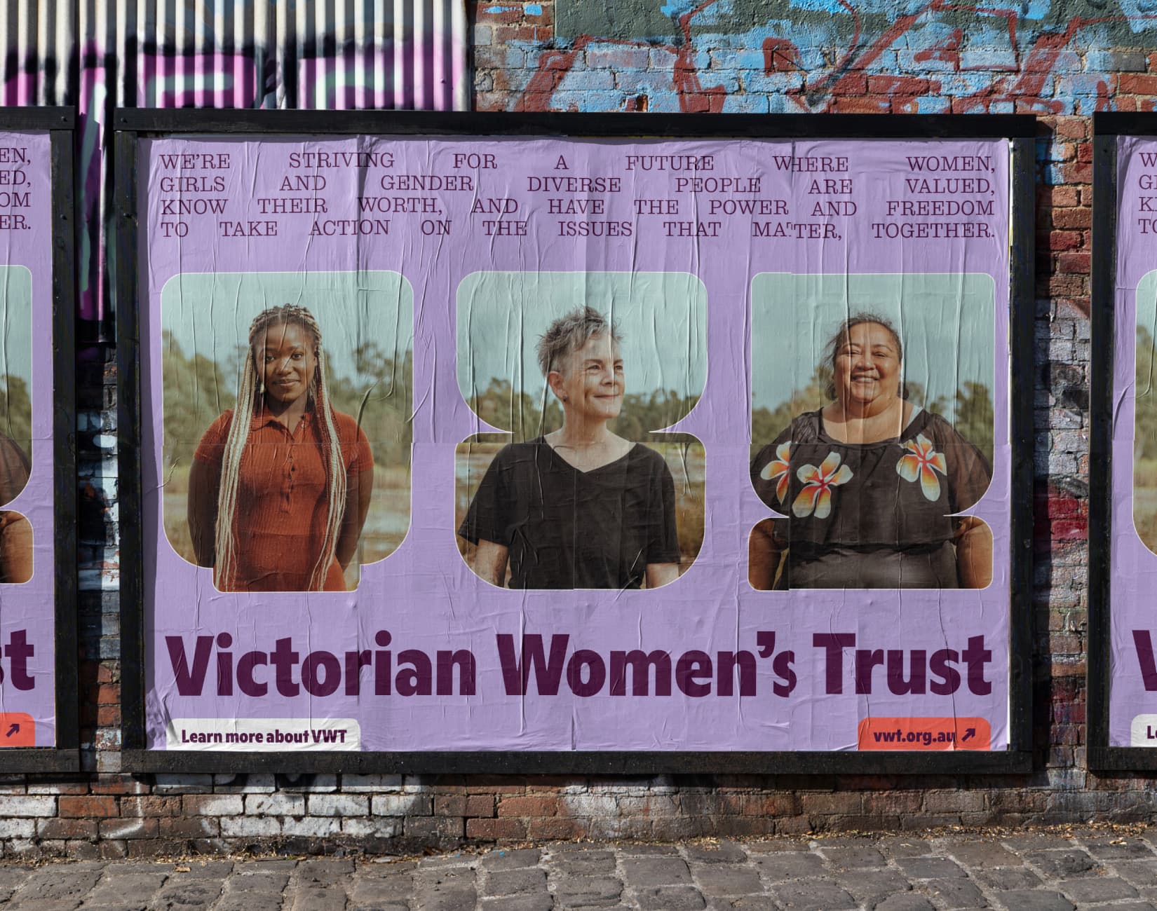
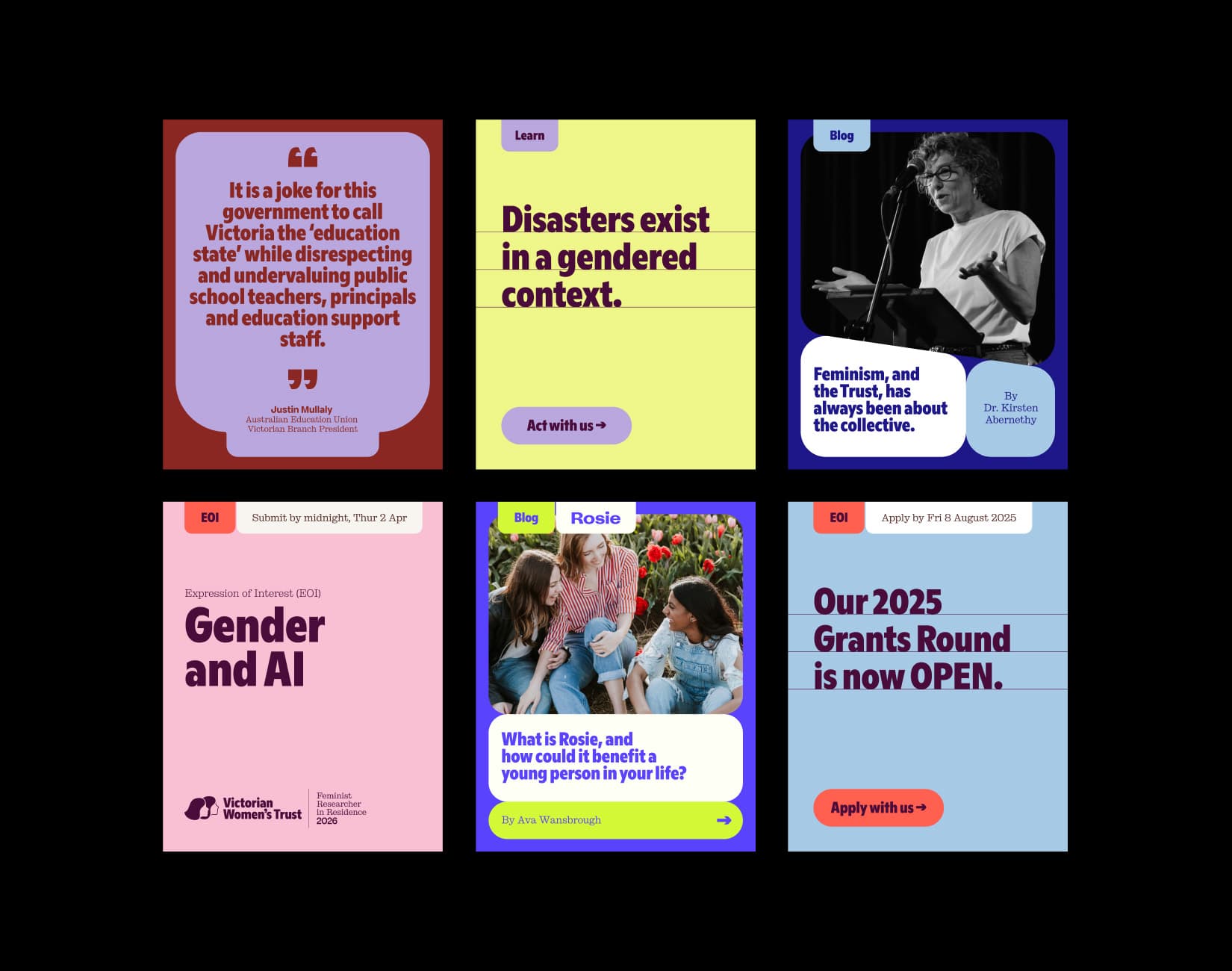
The Victorian Women’s Trust is a long-time collaborator of ours, and one of Australia’s most respected feminist organisations. They have funded more than 700 community projects and distributed close to $8 million since 1985. Forty years of that work had accumulated on a website that grew alongside it, and on a brand that no longer said what the organisation stood for. They came to us for a brand strategy and identity, a full information architecture rebuild, and a new website.
Challenge
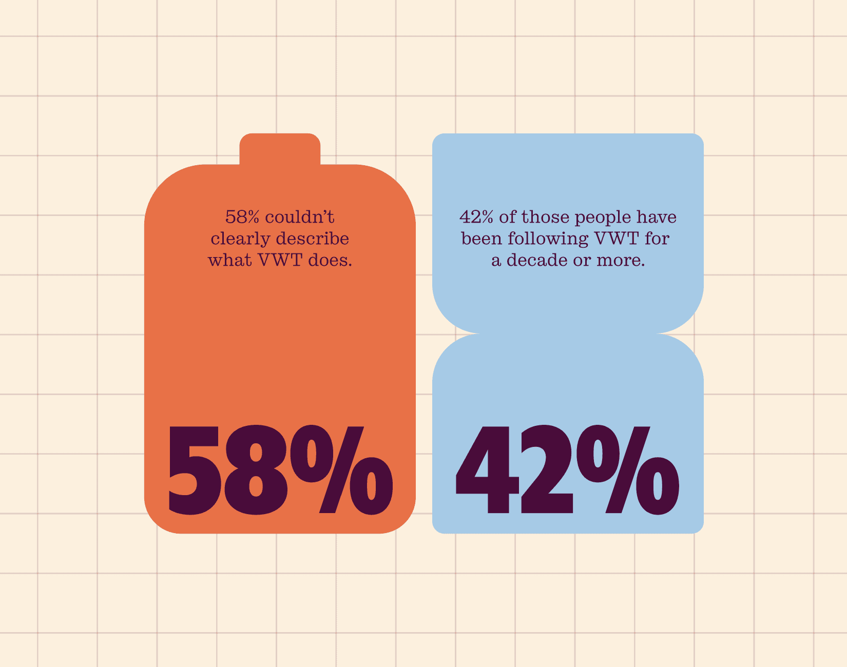
Forty years is a lot of story to carry. When we surveyed VWT’s audience, 58% couldn’t clearly describe what the organisation does, including 42% of the people who’d been following it for a decade or more. The brand needed to hold VWT’s legacy, find a shared answer for what VWT actually stood for today and move forward with the practical tools to sustain the organisation.
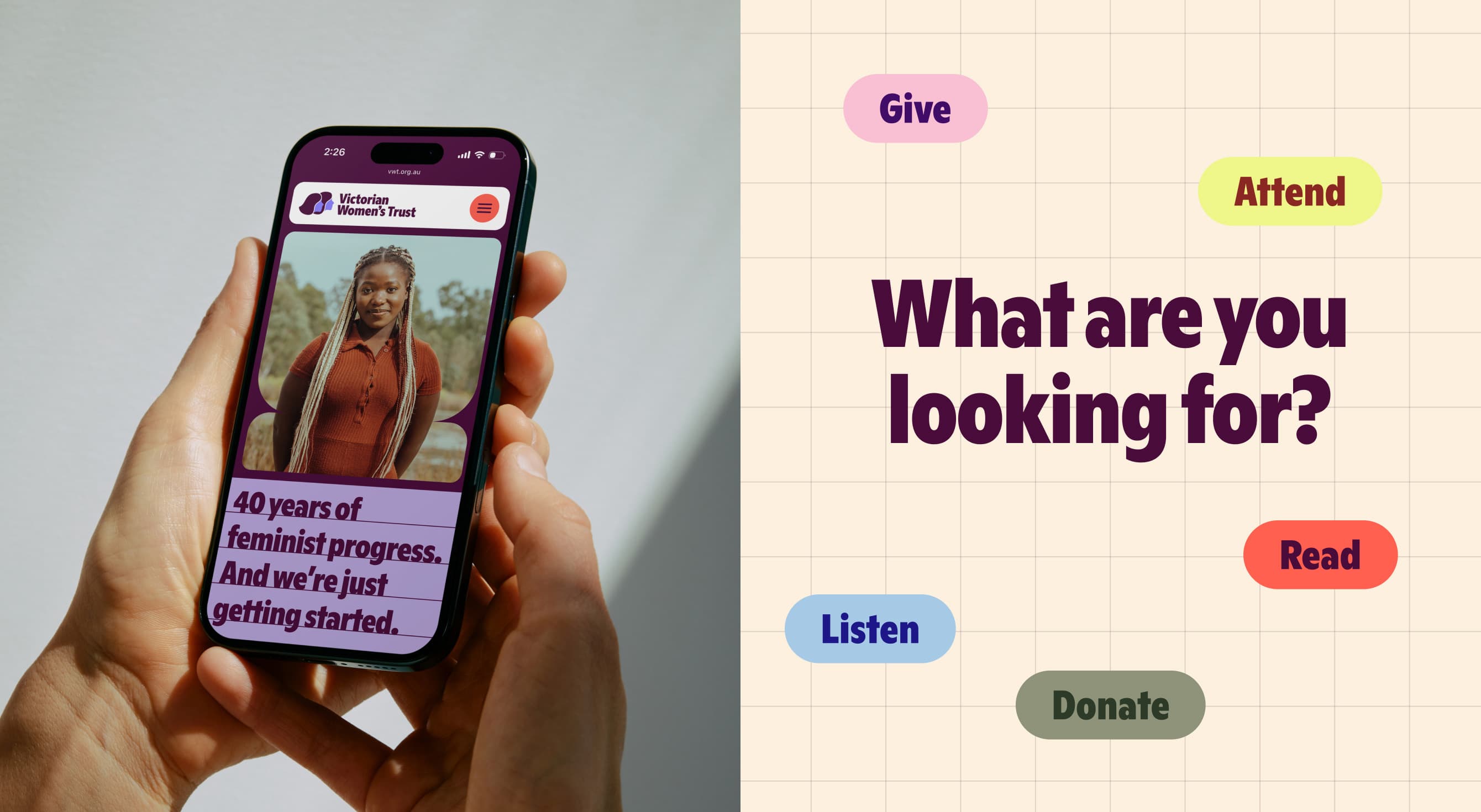
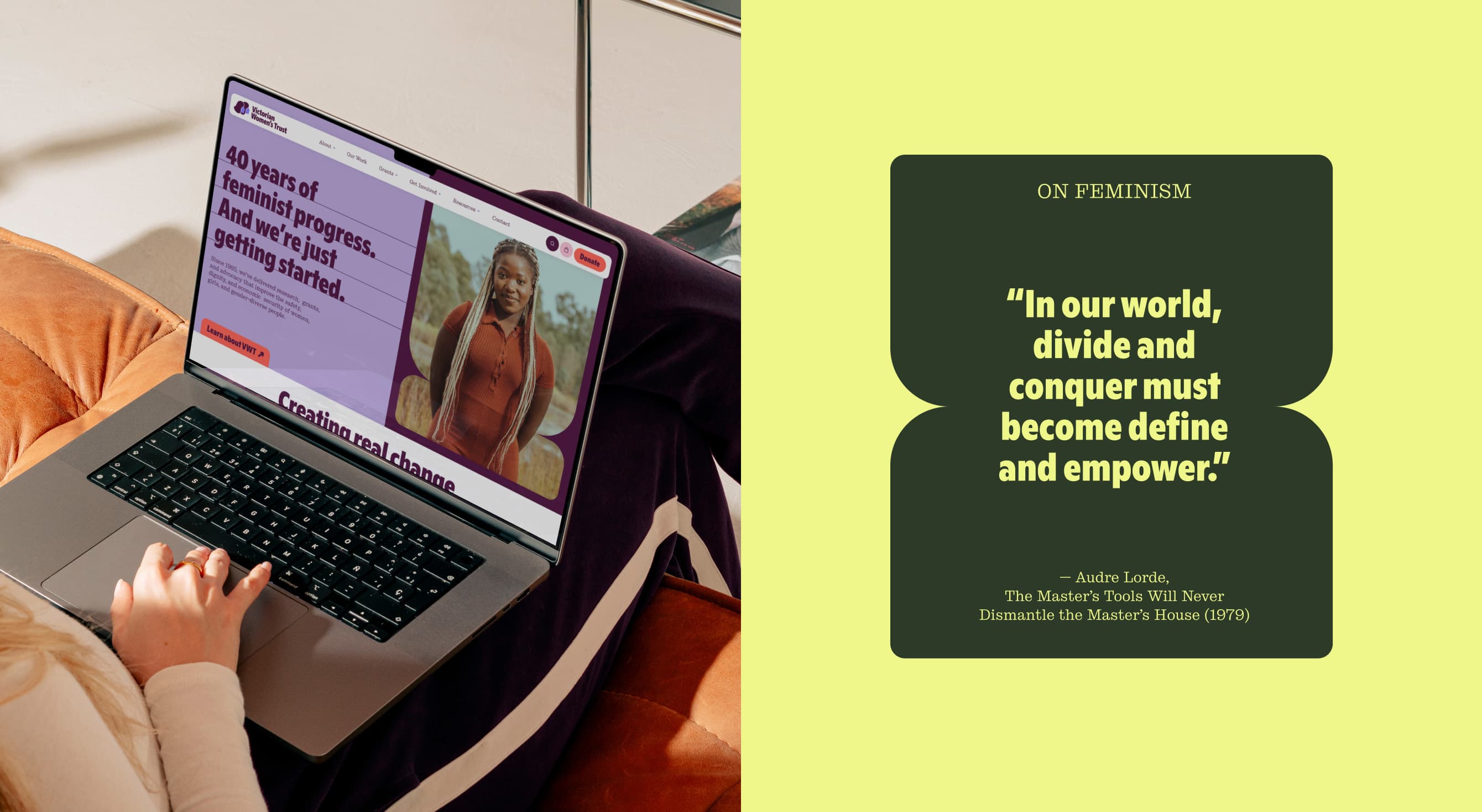
On the platform side, the focus was balancing decades of storytelling with simple pathways to action, especially around donations and grants, the site’s two hardest-working sections.
On brand, there was no single competitor to measure against, and no clear idea of how “feminism” itself was landing, both inside the organisation and out. That left us with two clear questions the strategy needed to address: what does the term mean to people today? And is the word ‘feminism’ now leaving people out and holding back our progress?
Process
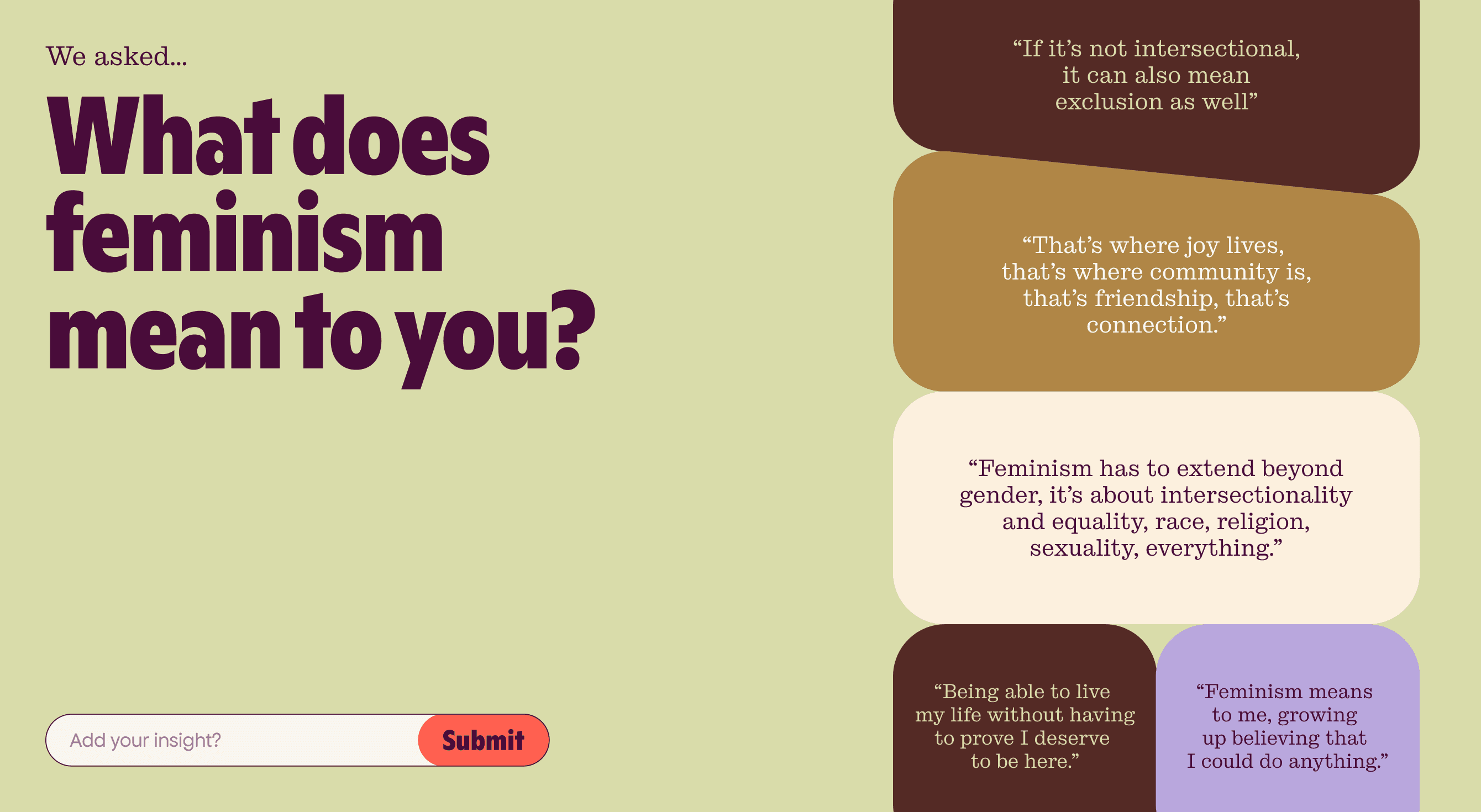
We ran brand discovery sessions, audience surveys and one-on-one interviews with staff, board and long-time supporters, alongside a one-day event where we sat down with 100+ people to ask what feminism means to them.
On the platform side, we audited the site page by page against what people arrived to do. Search data made one pattern obvious early: people were finding VWT through educational content, the gender equality timeline in particular, and almost never through donations or grants. Two functionality workshops followed, one on donations and one on grants, walking each journey from both the user side and the admin side.
Solutions —
Many ways in
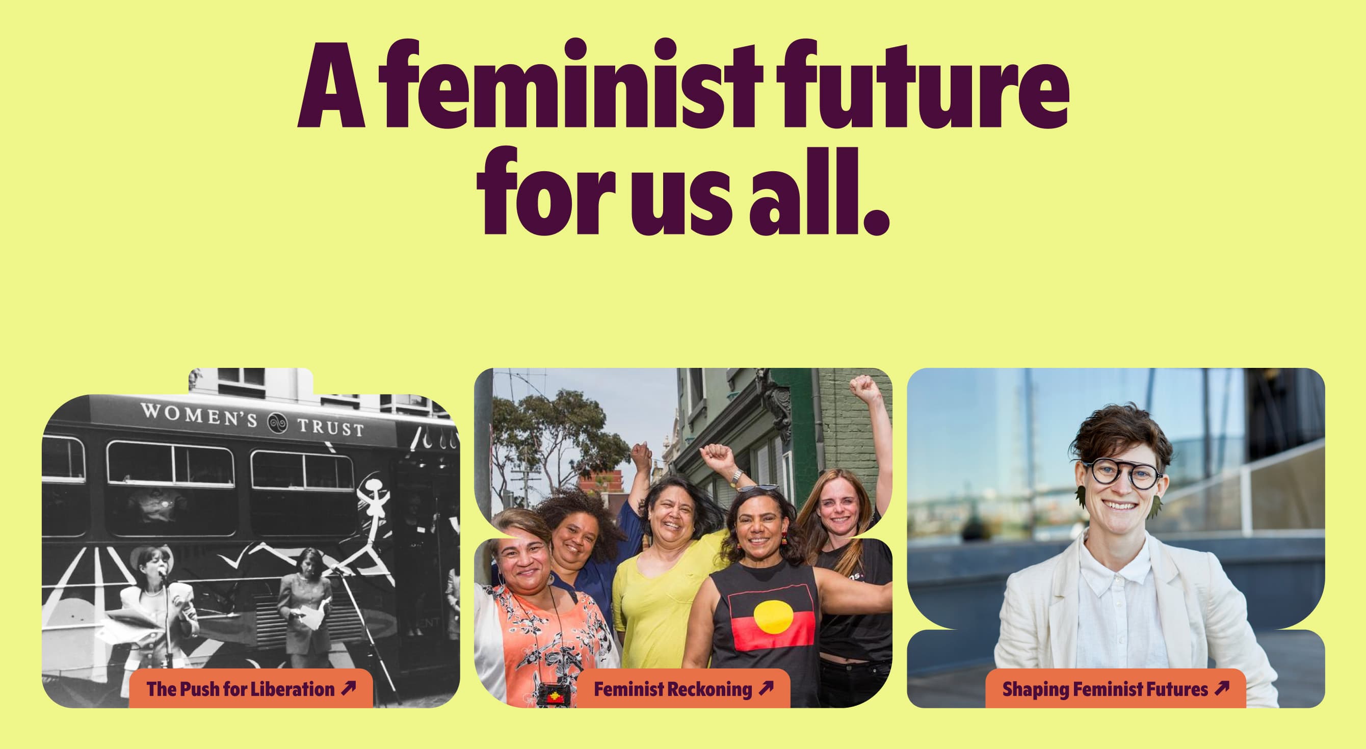
People arrive at feminism from different backgrounds, different beliefs, different starting points. The brand idea holds all of them: however you arrive, there’s space here for you. It gave VWT a position that didn’t depend on defending a word, and it set the structural principle for the website. Every section is a different door into the same organisation, and no single door has to be the ‘right’ one.
Brand system: The brand launched in a room women weren’t allowed into
‘Many ways in’ went offline before it went live. Feminism at the Pub was a one-day event held above The Retreat Hotel, one of the last spaces women weren’t allowed to enter until 1974, asking two questions: what is feminism to you, and what’s holding it back?
Those answers now sit on the homepage in the ‘What is Feminism?’ module. The event asked the question in a room, and the site continues to ask it.
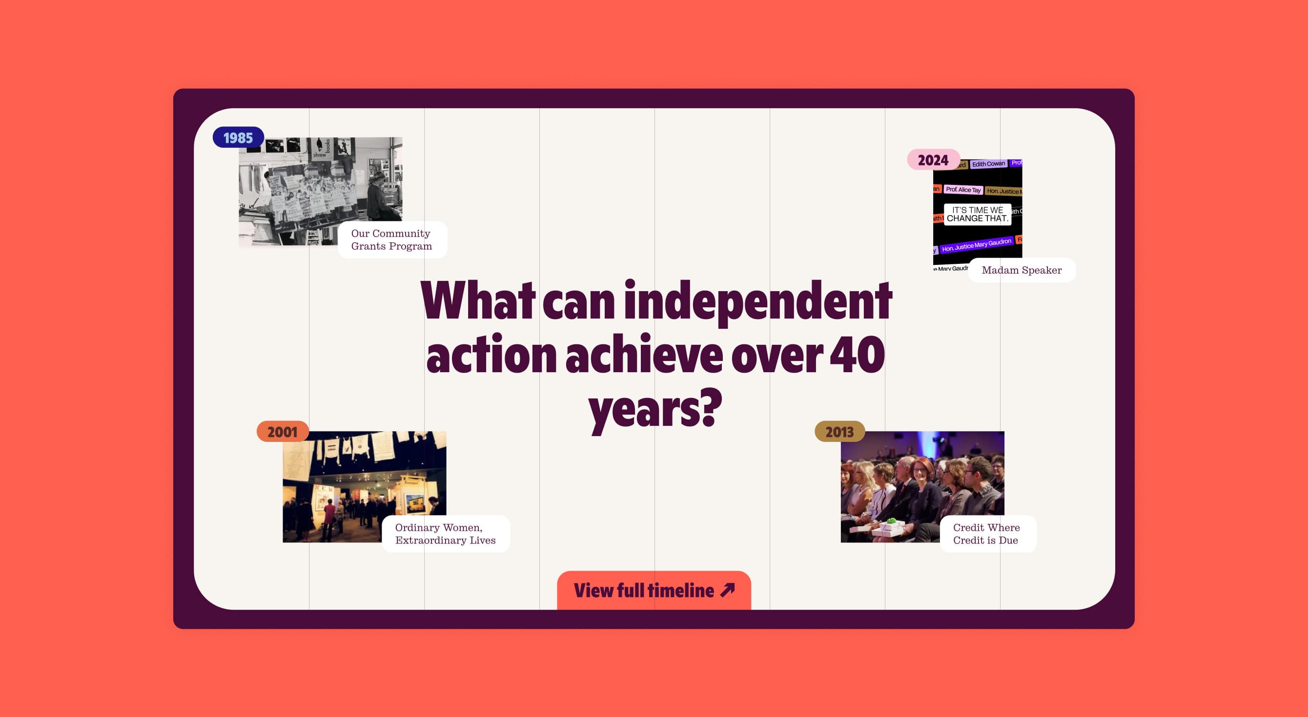
One timeline, two histories
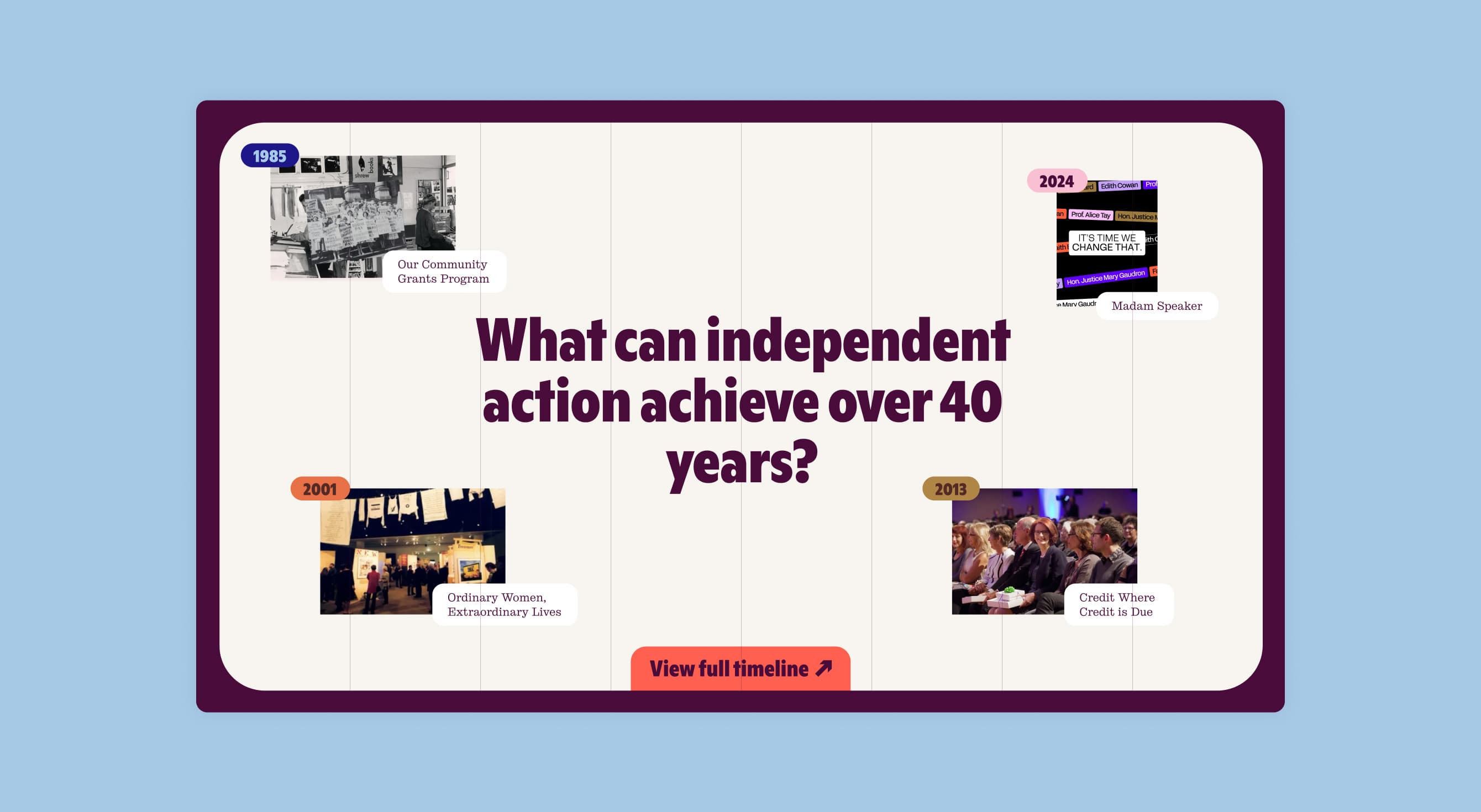
VWT’s gender equality timeline is the most-visited asset on the domain, built decades ago because nothing comparable existed. Most of the people using it are high school students working on assignments, alongside researchers and long-time feminists. On the old site, it sat three levels deep under About, split across five sibling pages.
It’s now the opening module of Our Work, with a toggle. VWT’s own history runs on one axis, the broader gender equality timeline on the other. Switch views and the Guaranteed Loan Fund of 1988 sits alongside Indigenous women winning the federal vote in 1962 and rape in marriage being outlawed in South Australia in 1976. VWT stops narrating the history and takes its place inside it.
Entries link through to project pages, so the timeline works as navigation rather than an article. The chapters are waves rather than decades, ending on Wave 5, Shaping Feminist Futures, which runs from 2020 to now.
Built for the team that has to run it
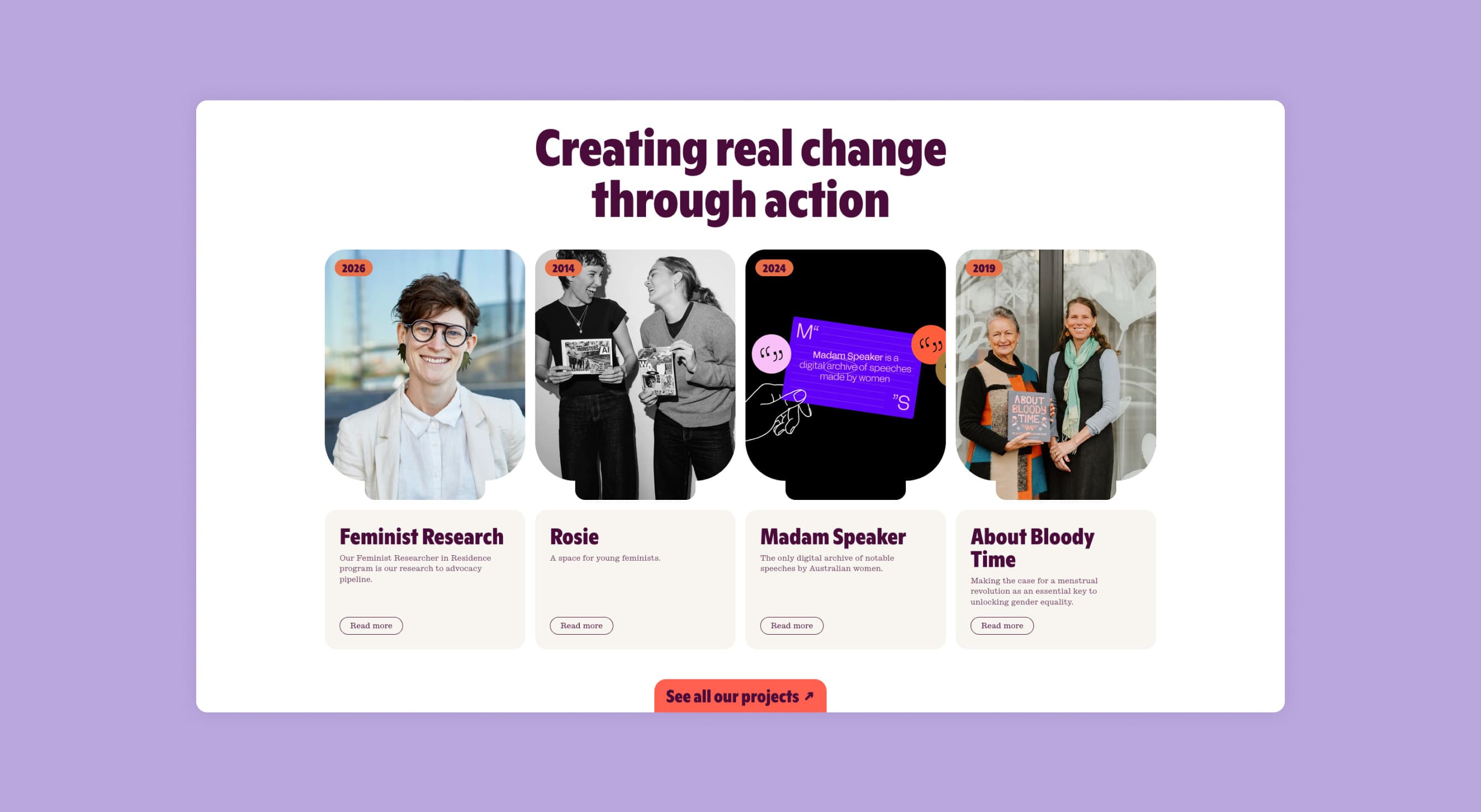
VWT runs with a small team, and the site had to be maintainable by people whose actual job is grantmaking. Projects, events, podcasts, journal entries and newsletters each run on a single template with a shared component set, so adding a project is a content task rather than a design decision.
The site architecture had one more job here. People regularly mistake VWT for a direct service provider and email asking for family violence support. Keeping VWT’s own projects distinct from the projects it funds was partly a decision about who gets sent where, and it shaped the split between Our Work and Grants.