QUIN: Queer Info Network
A digital health hub and information network designed for queer women.
Services —
- Branding
- Strategy
Industries —
- Government & Community
Thorne Harbour Health recognised a gap in accessible health resources tailored specifically for queer women. They required a brand identity and digital platform that moved beyond ‘clinical’ to more of a welcoming, community-focused directory.
Navigating sensitive information
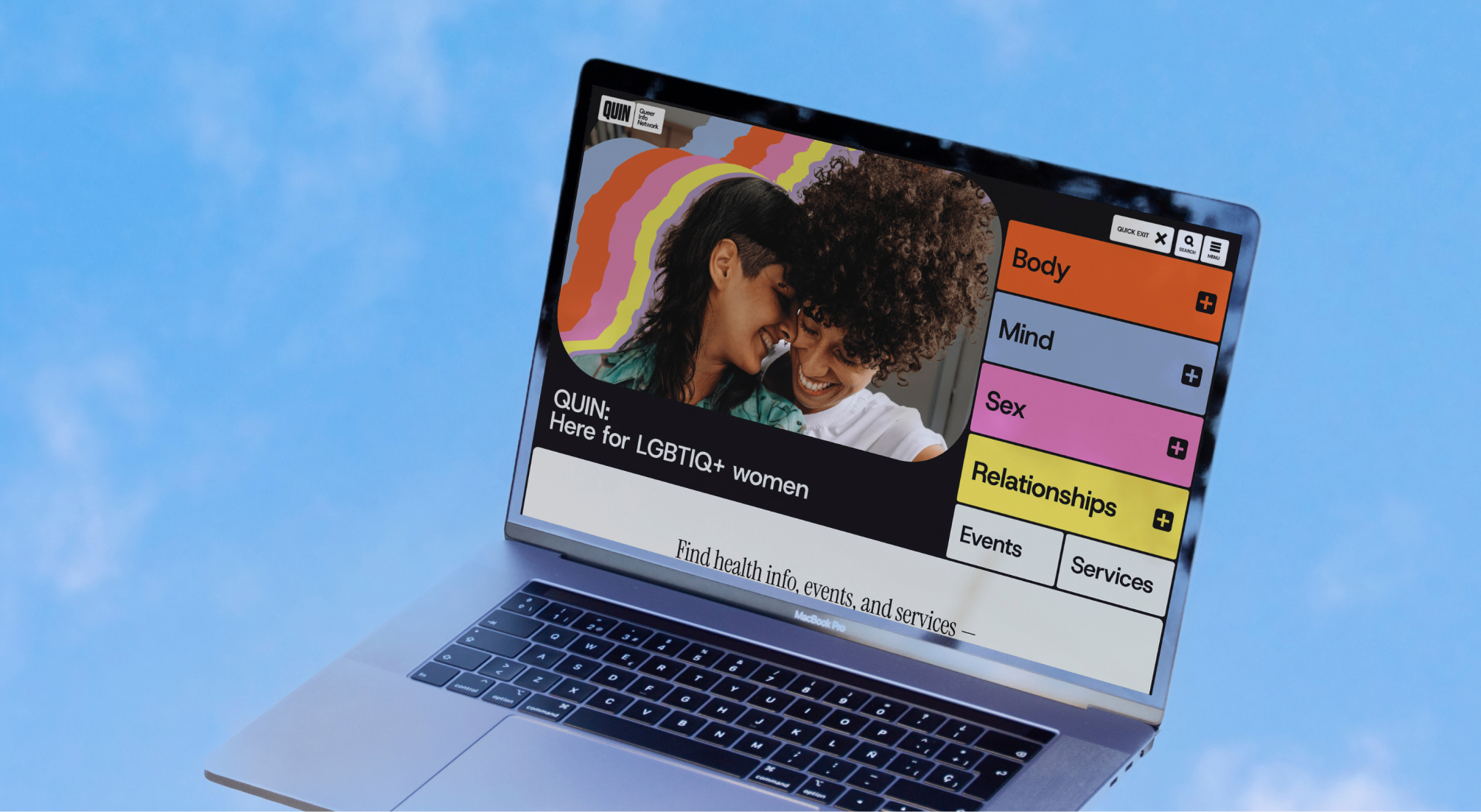
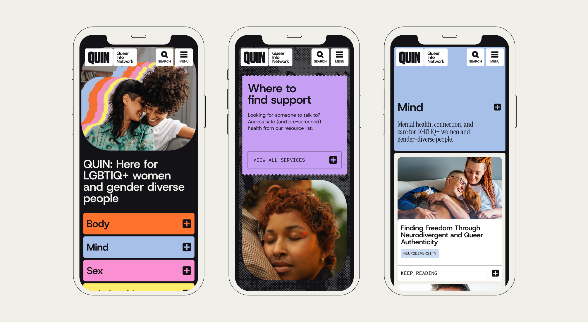
The platform needed to organise complex health topics, ranging from reproductive health to alcohol and drugs, without overwhelming the user. The visual challenge was to create an identity that resonated with a diverse, (potentially) older demographic, ensuring it felt credible and informational.
Rooted in research for digital design
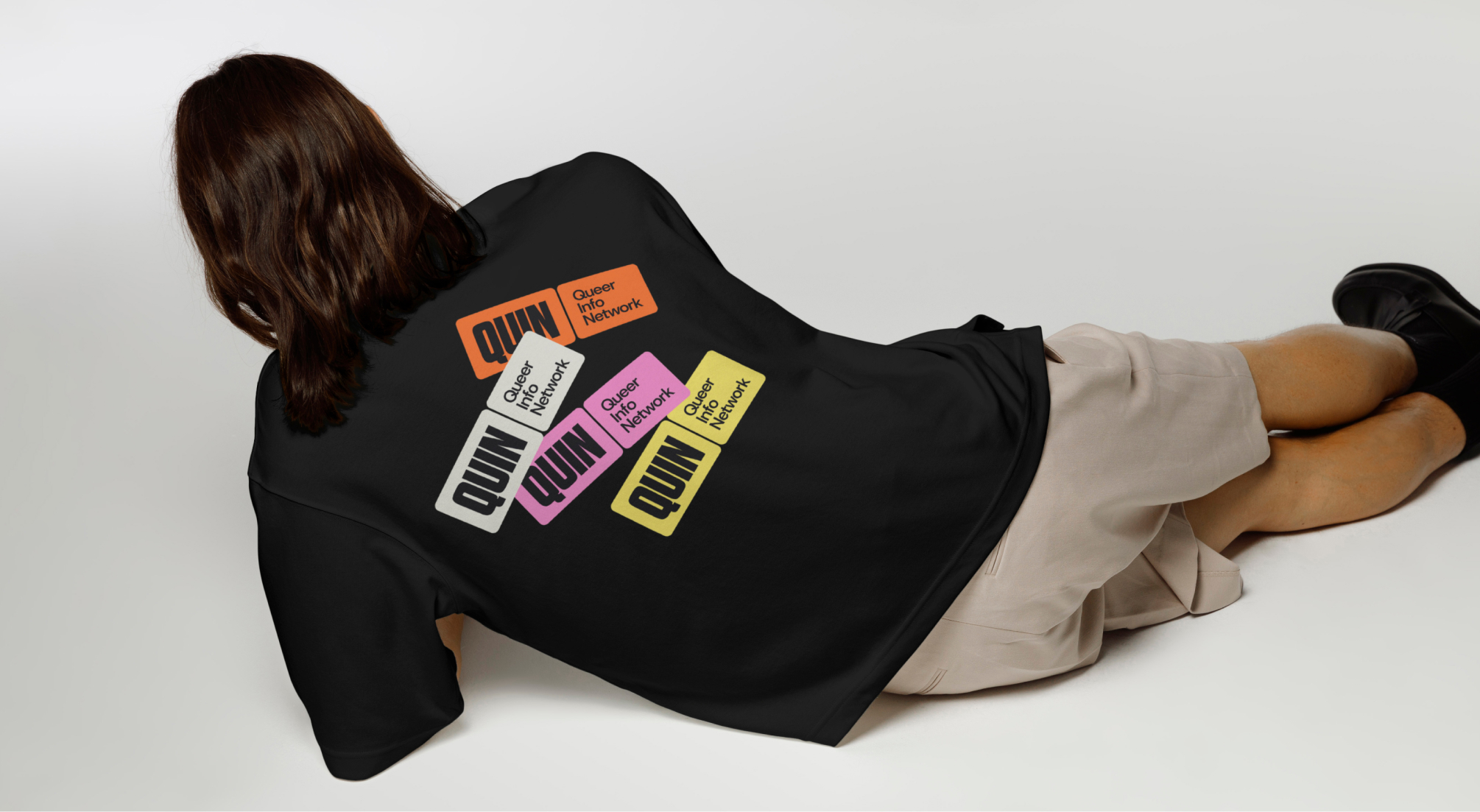
With the new brand name QUIN (Queer Info Network), the goal was to build this out not just as an acronym, but as a personable, trustworthy space.
Our strategy bridged the gap between historical community resources and modern web accessibility. We conducted deep research into vintage queer publications and zines to inform a visual language that felt authentic to the community. Simultaneously, the UX strategy focused on a clear hierarchy to utilise Main Categories, Sub-categories, and Themes to ensure users could filter and find critical articles intuitively.
A nod to heritage; balanced by modernity
The final design system harmonizes two distinct influences: the vibrant, digital-forward approach of modern healthcare and the tactile, “cut-and-paste” aesthetic of archival queer zines.
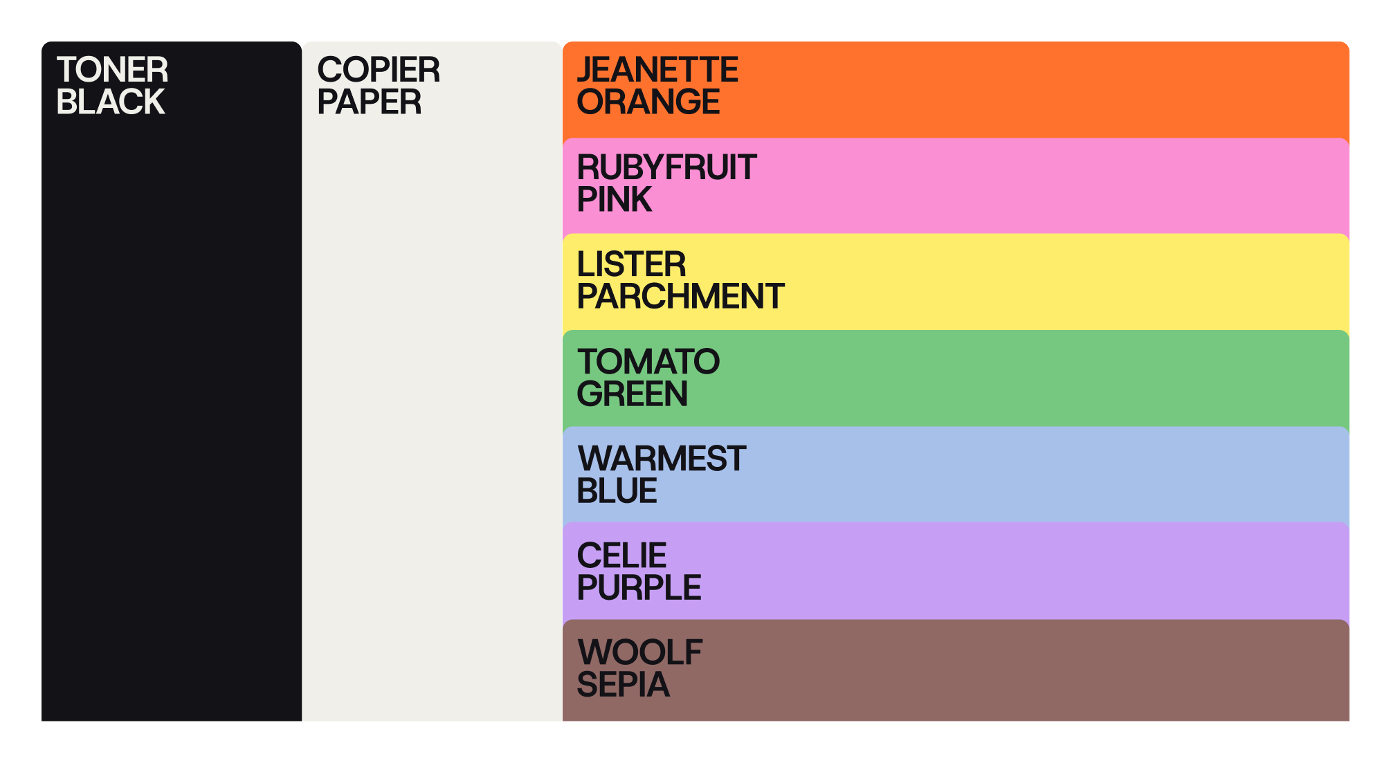
A slab serif typeface was used to provide a sense of credibility, softened by warm, personal photography. The colour palette avoided stereotypes, and is contrasted with a logo that incorporates the old-school print zine stamp style.