Nic & North
A new name, brand and web experience for a Melbourne real estate agency.
Services —
- Branding
- Communications
- Strategy
- Web Design & Development
Industries —
- Design & Property
Nic & North (previously Nic Power Real Estate) are a lean team of experienced agents operating across Melbourne’s inner north. That leanness is intentional – it means they can better serve clients and hold a deeper connection to the places they want to live.
Challenge
In a crowded market where agencies look and sound the same, a clear opportunity presented itself to define a real estate agency doing something genuinely different – in their model, their philosophy, and their day-to-day approach. We solidified their position by developing an entirely new brand experience across every touchpoint: visual and verbal identity, website, and physical presence across Melbourne. Starting with a name that spoke directly to what they’re about.
Process
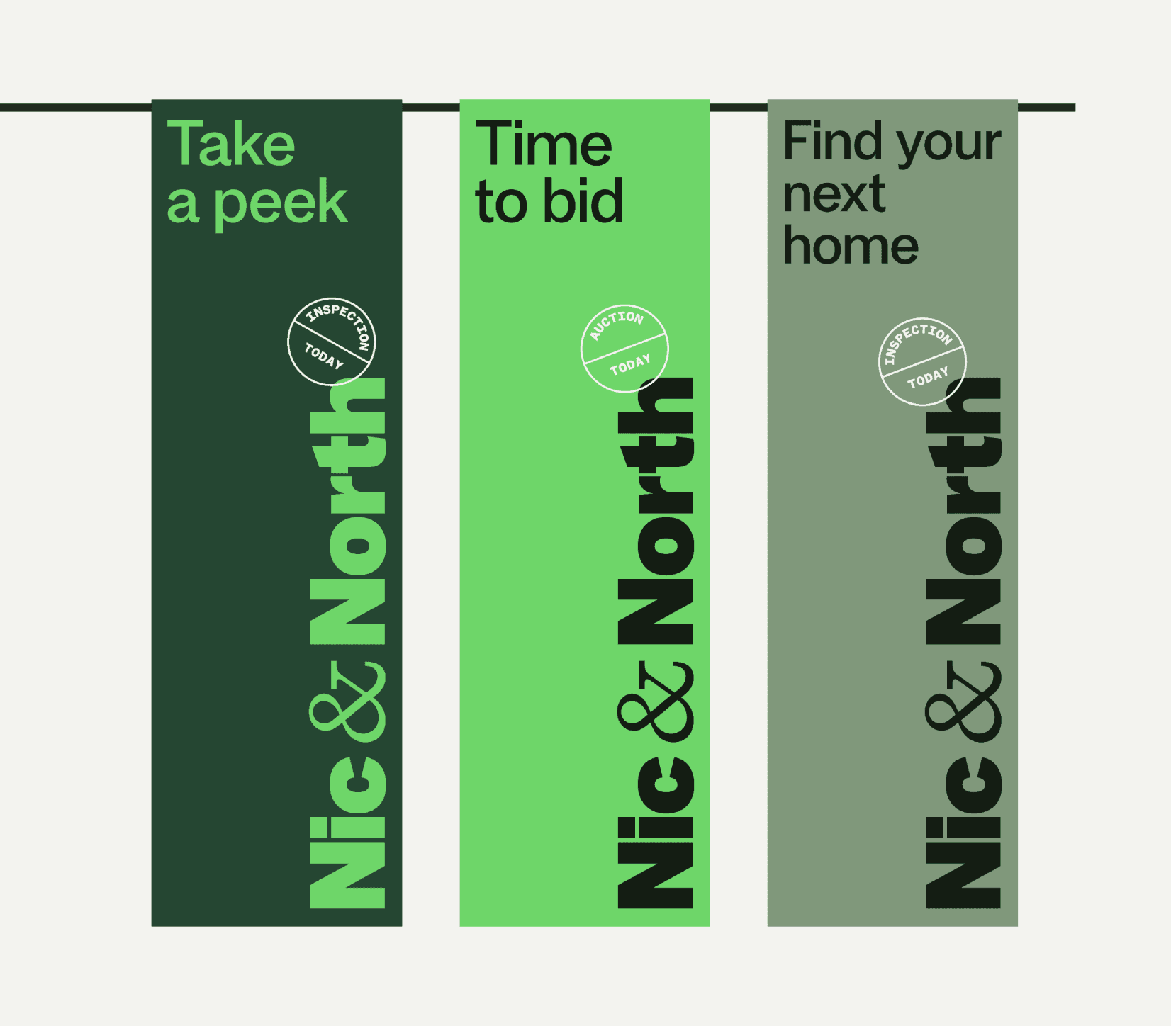
From our discovery phase, it was clear that many agencies claim to put people first – few actually build their operating model around it. Our approach was to help them advance into the market with that belief at the forefront, using it as the anchor for everything downstream: the story they tell, the identity system, how they show up online, and how they present across physical sites and signboards

A name that says it all
The positioning landed simply: a real estate agent in Melbourne’s North, putting the people part first. From there, the name followed. A nod to their existing identity and company founder at the front, paired with the place they know best. A split logo lockup extends this further, acting as a device to hold people and place across every application.
A visual identity that owns a green
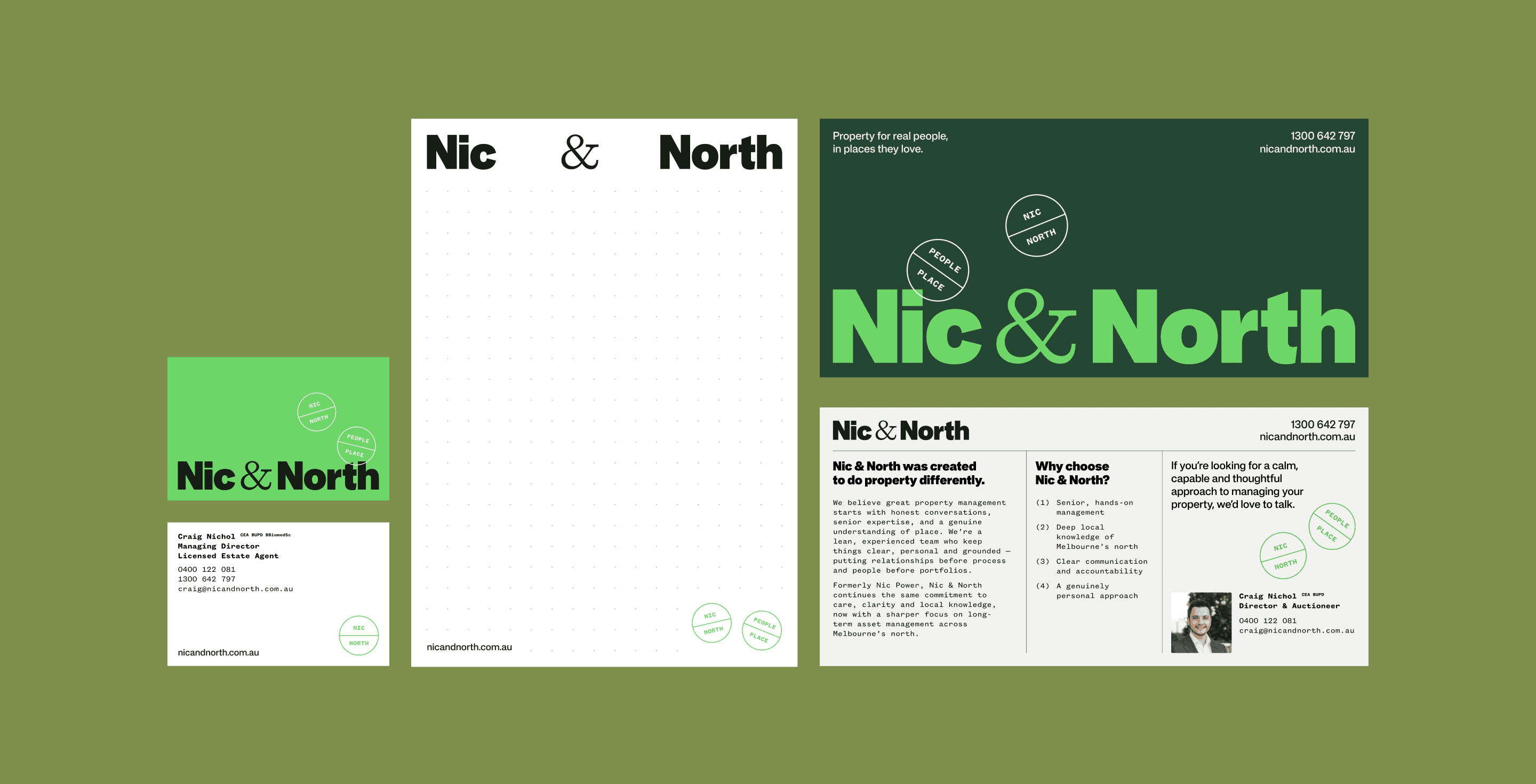
The colour system is built around a defining colour Nic & Power could own. A deep core green, punctuated by a vibrant, electric green used sparingly to cut through.
A stamp system
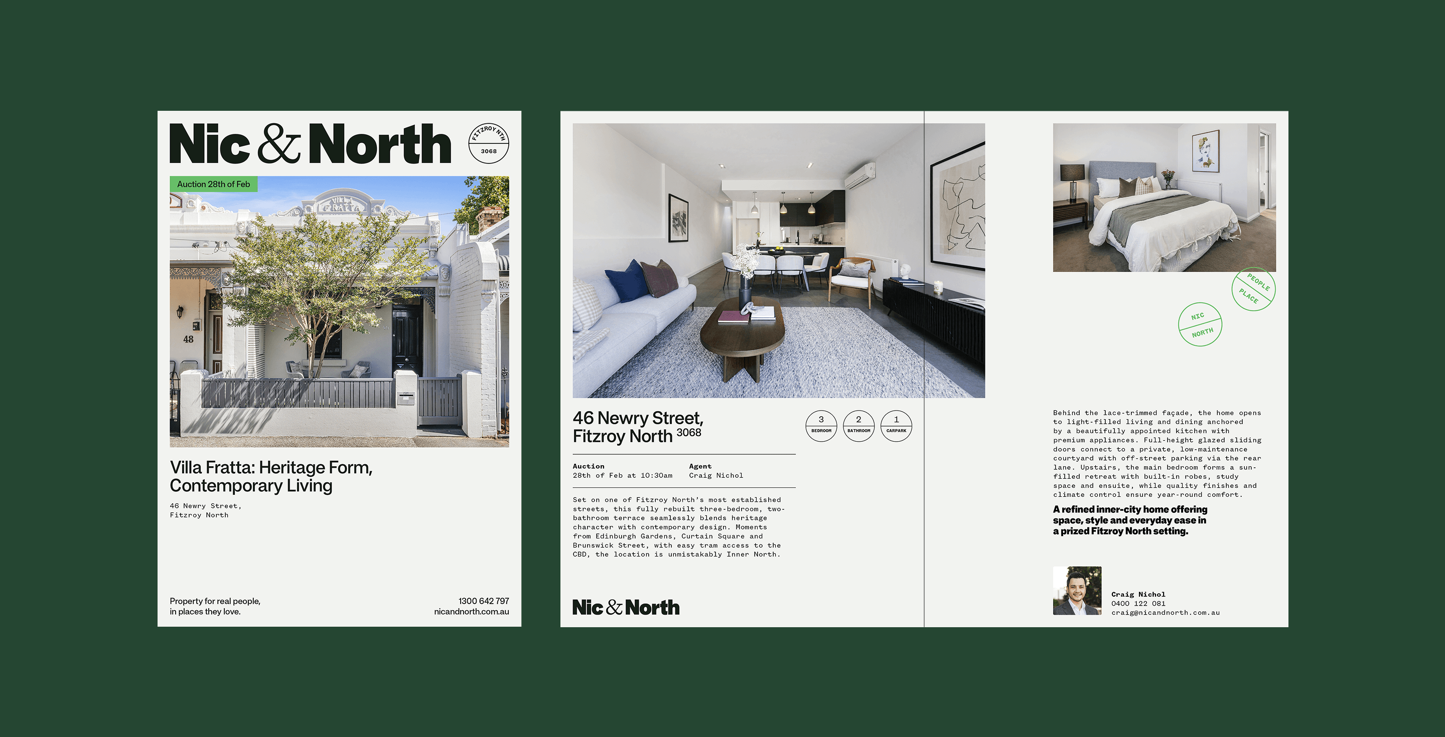
Carrying the people and place duality through to collateral, a set of postcode-specific stamps — Fitzroy, Brunswick, Northcote and beyond — add local utility and personality to every touchpoint. Another device to carry the position — people and place — across every touchpoint.