Go-to-market brand strategy, with assets derived from algorithms — offering a revolutionary and purposeful solution for infrastructure as a service.
The big challenge here was to take a new brand to market, pitting it directly against the world’s largest tech giants. The solution needed to focus on the new offering, the sustainable aspect, and how the product could potentially cut through the current market.
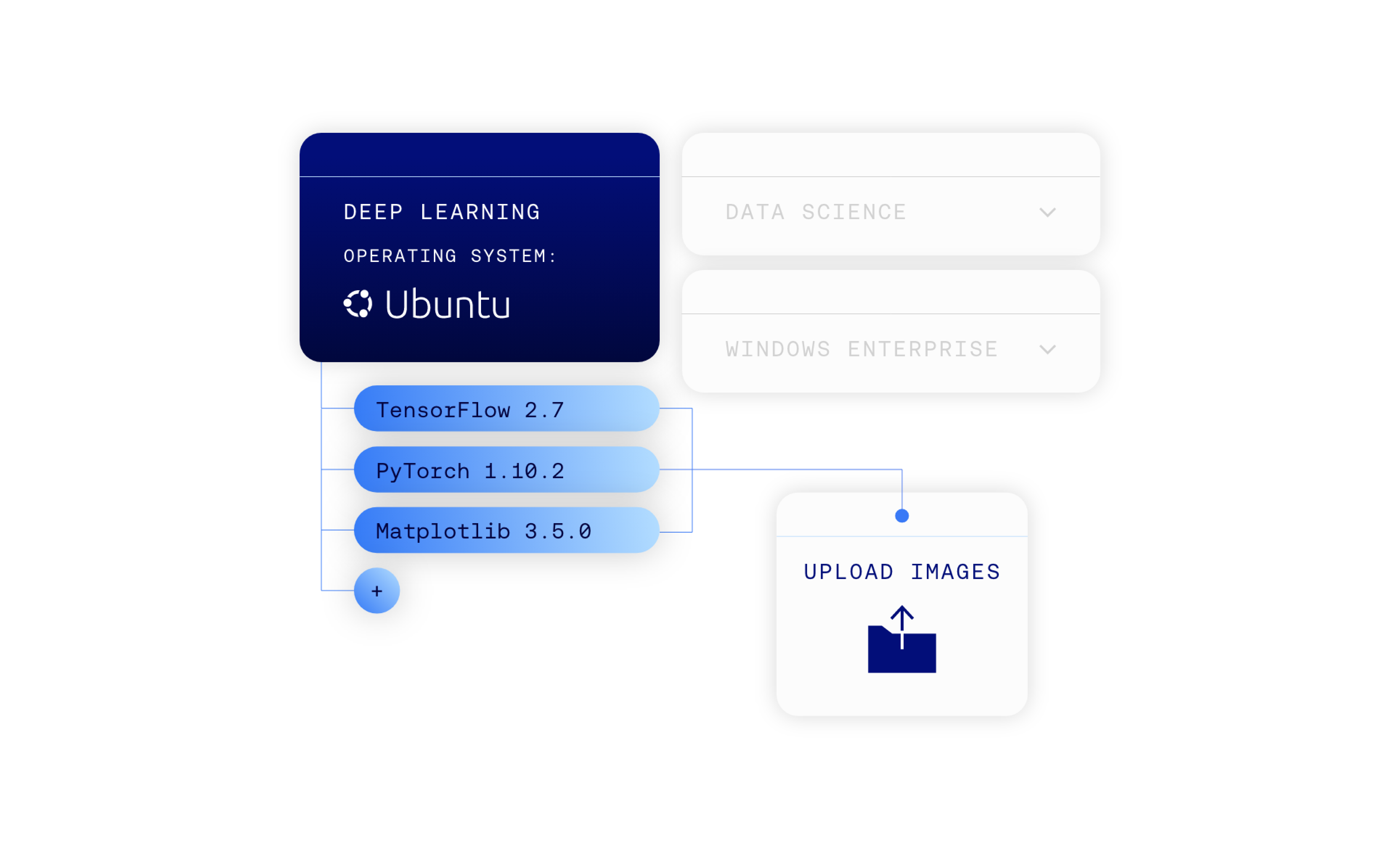
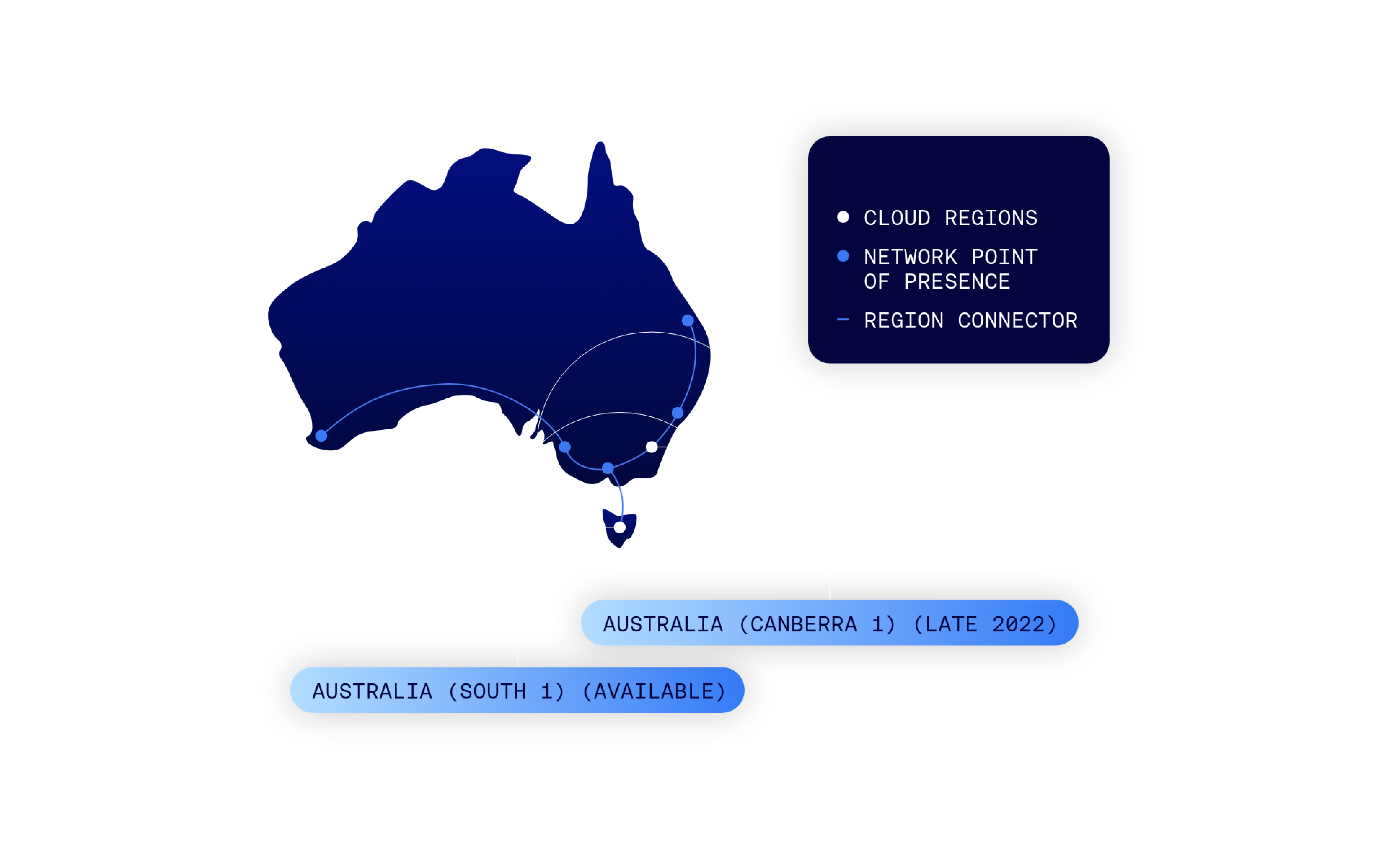
The end-to-end design of Supercloud went beyond a website, to include the design of the Supercloud console and portal, the naming of physical modules, and individual products.
Branding an intangible product is always going to be an exciting challenge. In this case, Supercloud initially started as a sub-brand until it was deemed to be better off as independent.
The design-led strategy had to start with unpacking its complexity.
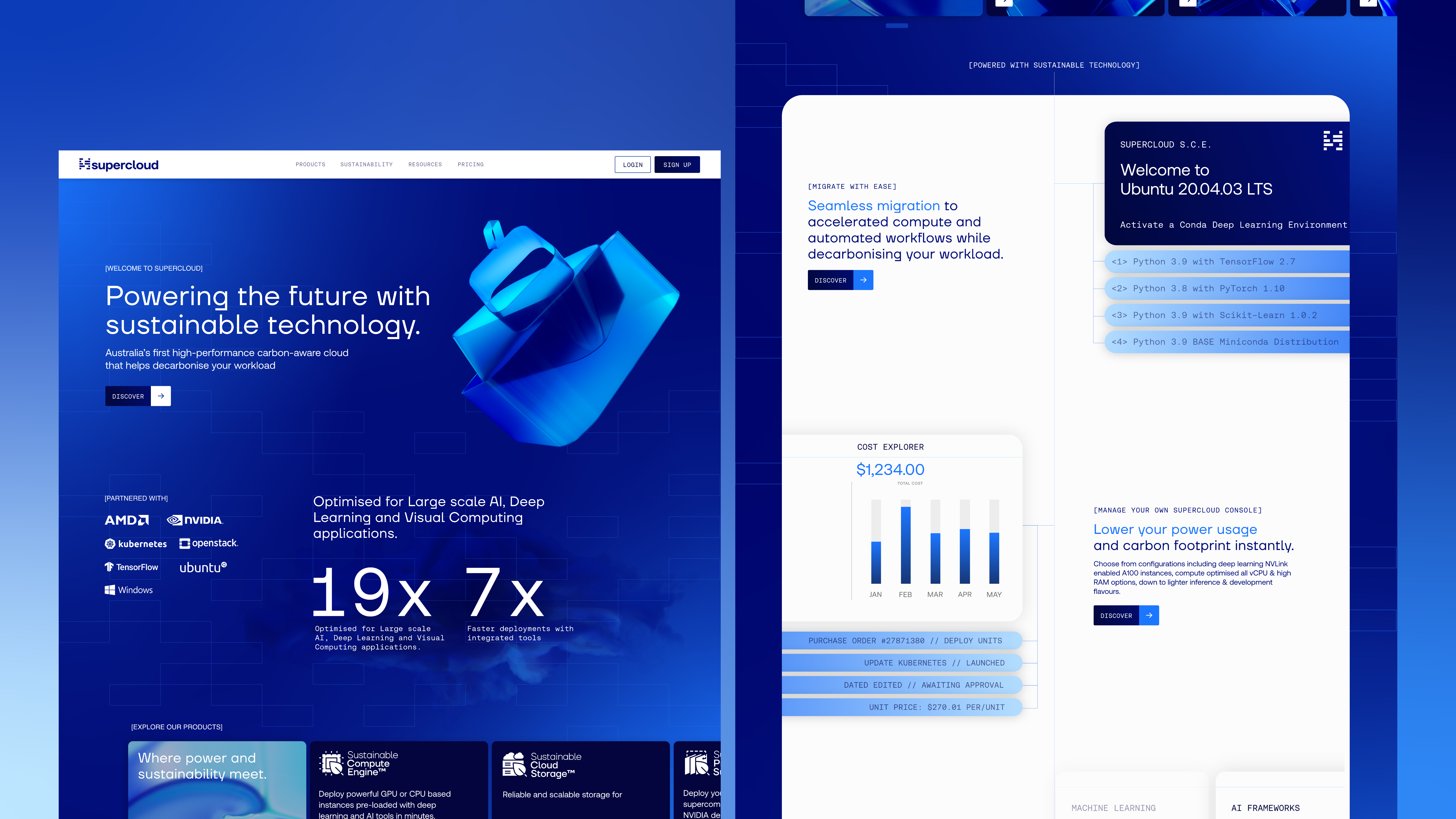
Design thinking reinvented the way typical portal designs were done, to create an immersive and user-friendly experience. The UX design and brand elements took inspiration from the technology behind the cloud, using immersion fluid and 3D objects to represent the product range.
As a brand witnessing evolution, the process fed off the offering. The brand needed to align with its modern consumer-facing brand while giving it space to pivot with the growing product offering.
The eco-tech industry has a standard look that was beginning to saturate the market. The question arose — how do we make it sustainable, and clean while emphasising its efficiency?
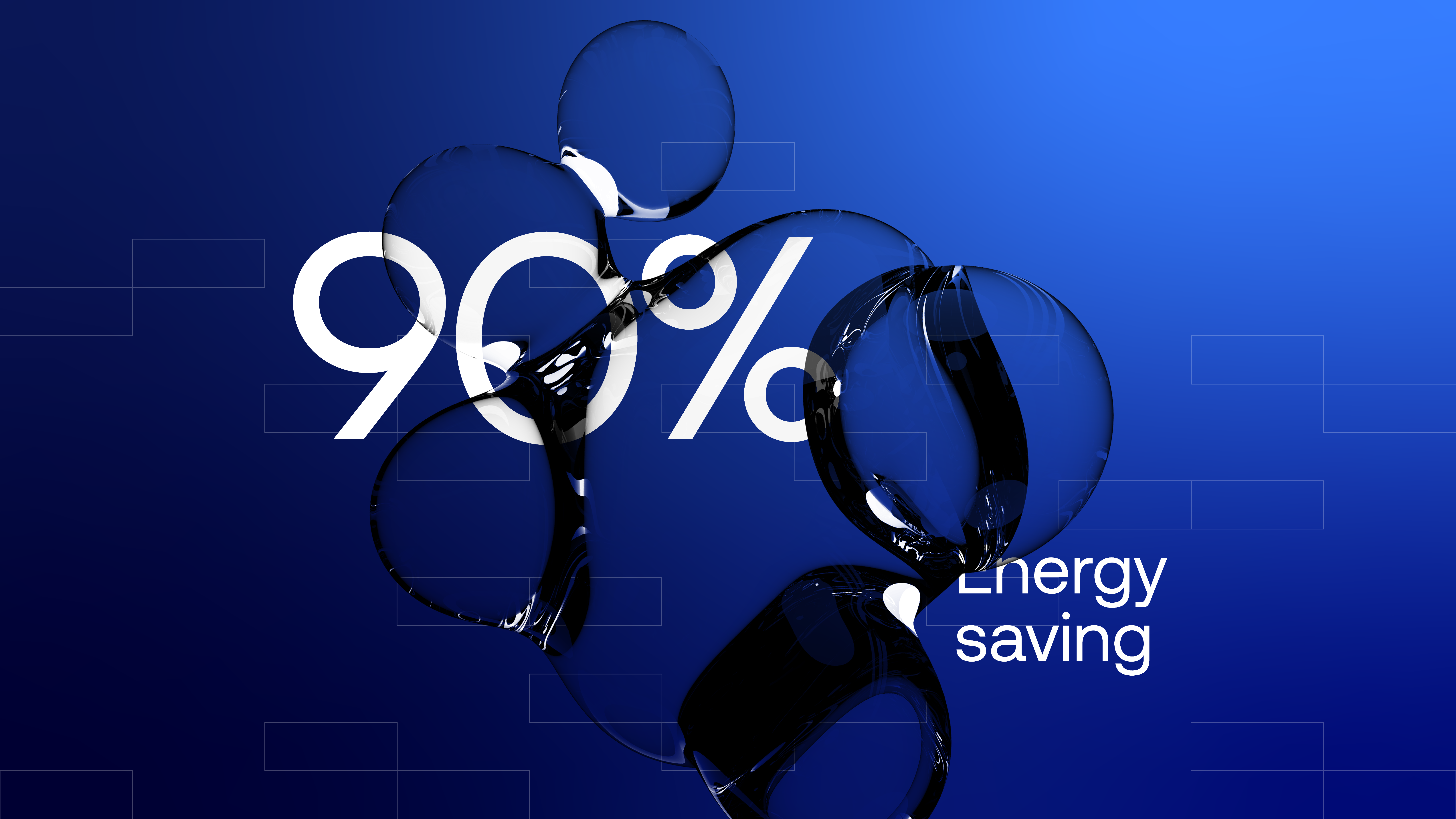
Stepping away from the green-washed look gives a clean, clear and controlled aesthetic. To strike that balance between simplification and technical, design exploration led to Glass Morphism.
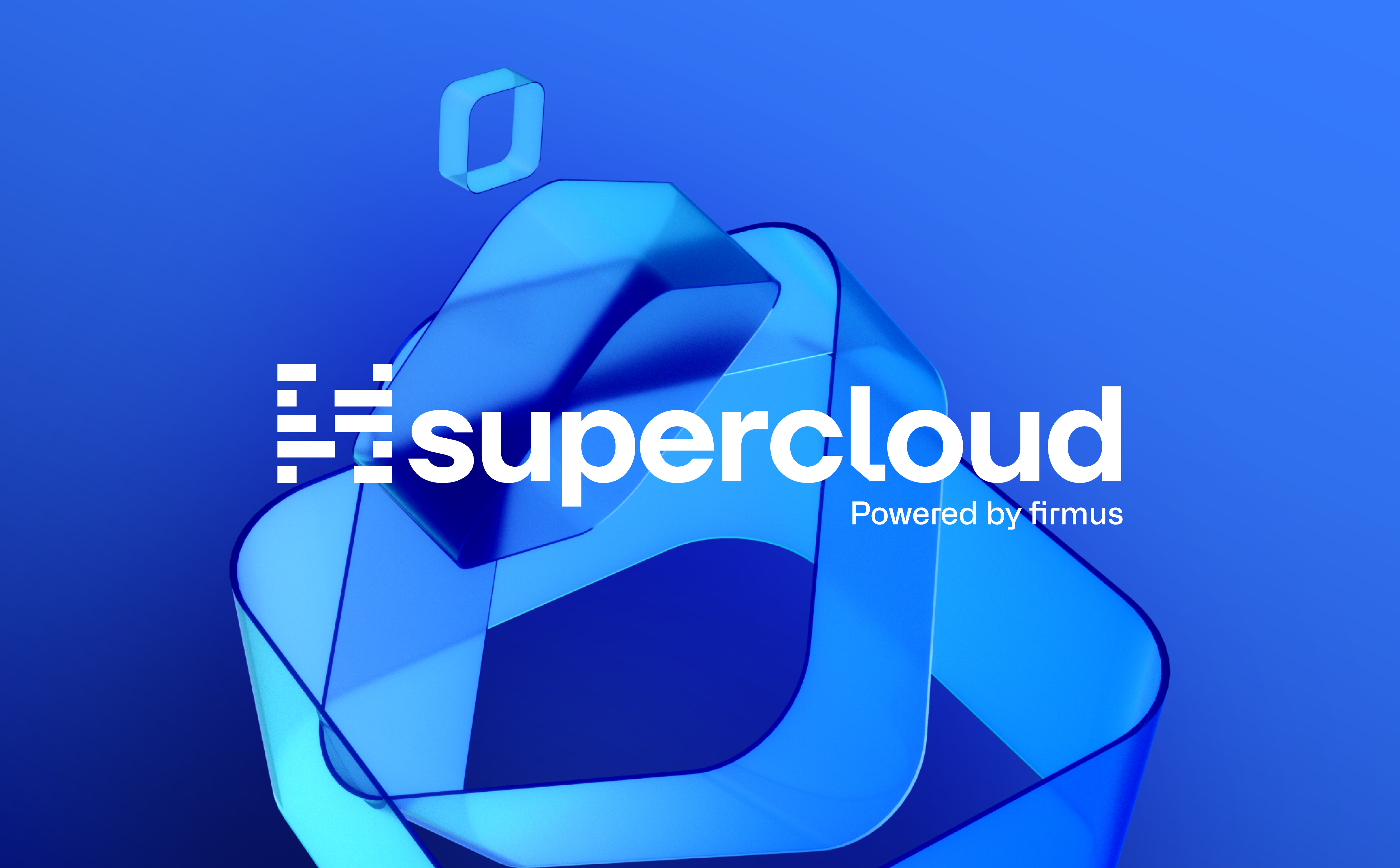
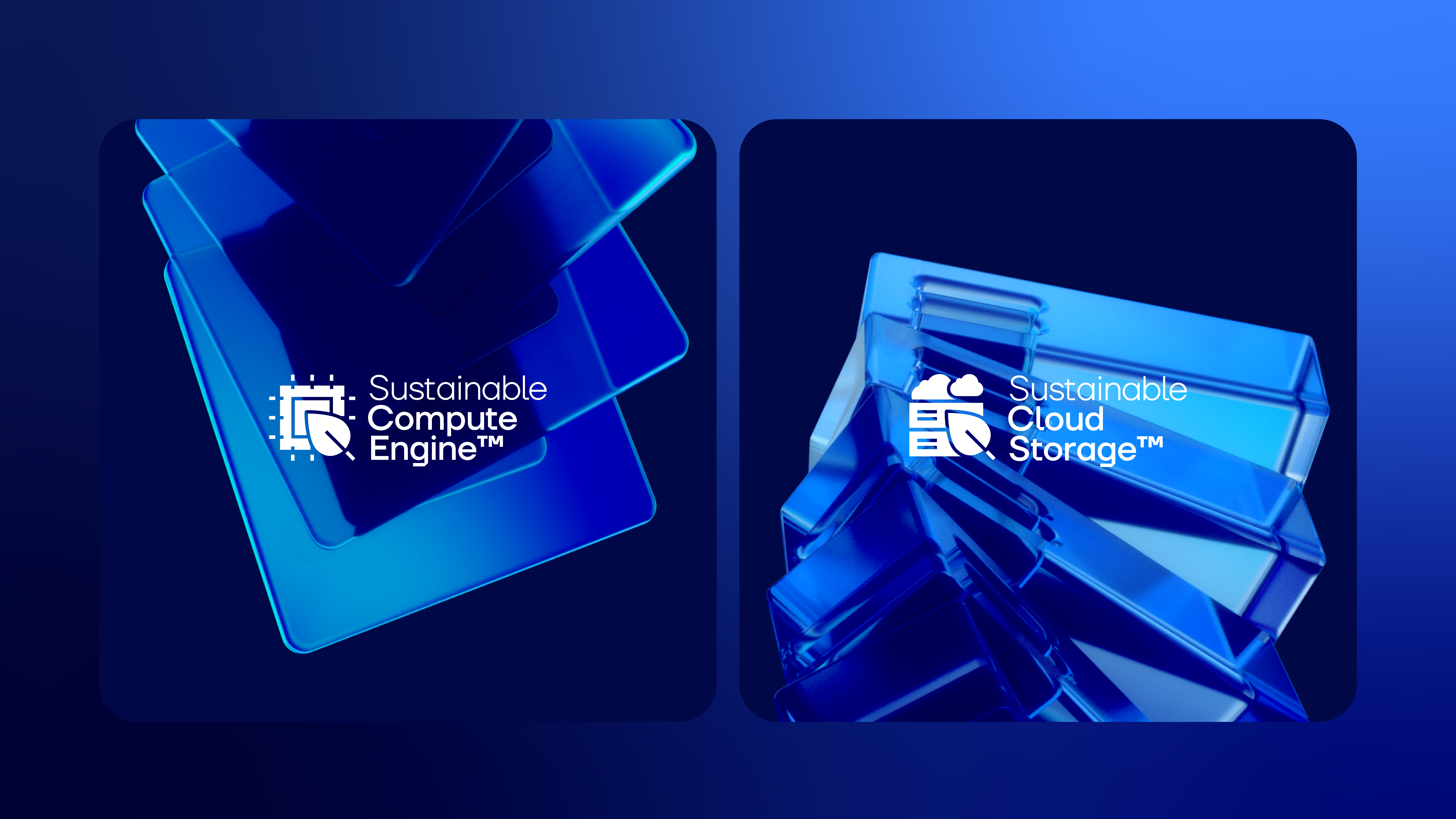
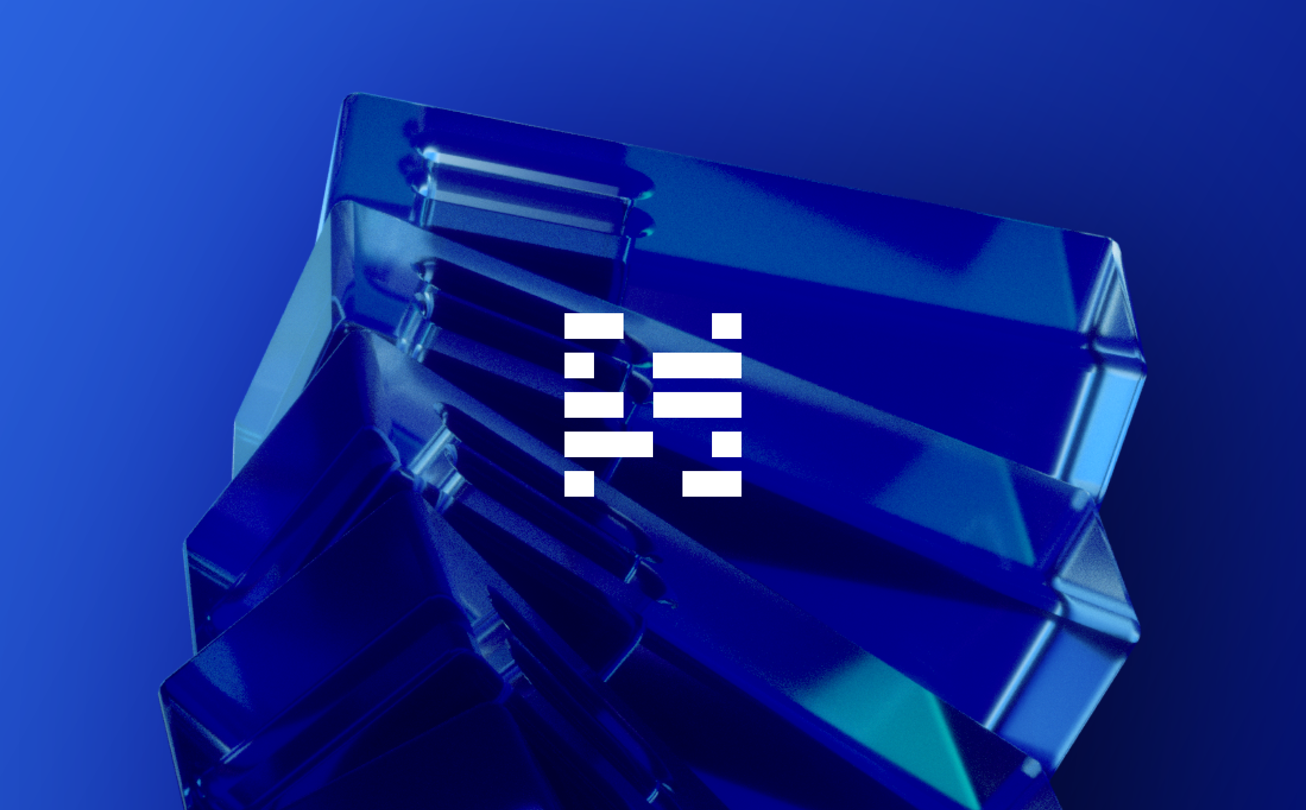
It aided in building visuals for an intangible product — core elements of the brand were generated in a 3D space and then overlaid.
Each individual product had its own creative brand mark, giving it visual strength through reflection, repetition and refined powerful objects.
Seamlessness played a big part in the product offering, which is reflected in the fluidity presented through the design. Every graphic, element or module showcases textures to represent this fluidity and seamlessness — almost making it seem alive.
Stills were rendered from iconography representing the services, taking into account the actual parts of the core product such as the immersion fluid.
The brand immerses you in the mindset of the technology on offer — clean, efficient and the best on the market.
Looking for a creative project?
Let’s connect, chat, collaborate.